


What are SVGs?
Scalable Vector Graphics (SVG) are a method computers use to describe an image. Just like any other image format.
Unlike many other image formats, the SVG format is text-based. More precisely, SVGs are XML-based. This opens up how we can interact with the image. It allows us to integrate SVGs with other Web standards such as HTML, CSS and JavaScript.
"SVG is, essentially, to graphics what HTML is to text." MDN docs
How do SVGs work?
Image files like .jpeg and .png are raster-based. That means they use millions of tiny dots called pixels to define the image's appearance. For every pixel, they define a red, green and blue value, which then gets displayed on the screen. The more pixels they define, the higher the resolution of the image.
SVGs take a different approach. Vector graphics like SVGs use rules to describe how the image should look.
Instead of storing values for millions of pixels, an SVG creates a viewport. You can think of it like a canvas. It then specifies points on that viewport along with instructions on how to connect those points. It is up to the computer to calculate where to paint. This rule-based format gives them the ability to scale without losing quality. Hence, Scalable Vector Graphic.
Why use SVGs?
Because SVGs are rule-based and calculated on the fly by the computer, they can:
- scale indefinitely without losing quality
- fit any screen size (great for responsive)
- have tiny file sizes and thus load very quickly
- trigger fewer HTTP requests
- be edited and created in code
- have individually addressable parts (like a circle or line)
- be animated!
These last 3 points are alluring because they give us more creative control over the final image.
Adding SVGs to the Web
There are many ways to incorporate SVG images into HTML, including:
- as a
srcto an<img>tag - in an
<object>tag - in an
<iframe>tag - using the
<svg>tag
We will focus on the <svg> tag for our purposes. If you're interested in learning about the others, there is an excellent CSS Tricks article on this subject.
The <svg> Element
The <svg> element is the container for our image. It can hold all other elements, such as lines, circles, paths and even other <svg> elements.
To fully grasp how it works, there are 3 crucial concepts that we need to cover first, namely:
- Viewport
- The
viewBoxattribute - The
preserveAspectRatioattribute
If you nail these three concepts, everything else will fall into place. Are you ready?
Okay, let's go!
Viewport
The viewport is the area of a computer graphic that is currently visible. Think of the display area of an editing tool, a computer game or your favourite web browser.
The Browser Viewport
The viewport for web browsers is usually the same as the browser window. That means everything except the browser UI, such as tabs, address bar, etc.
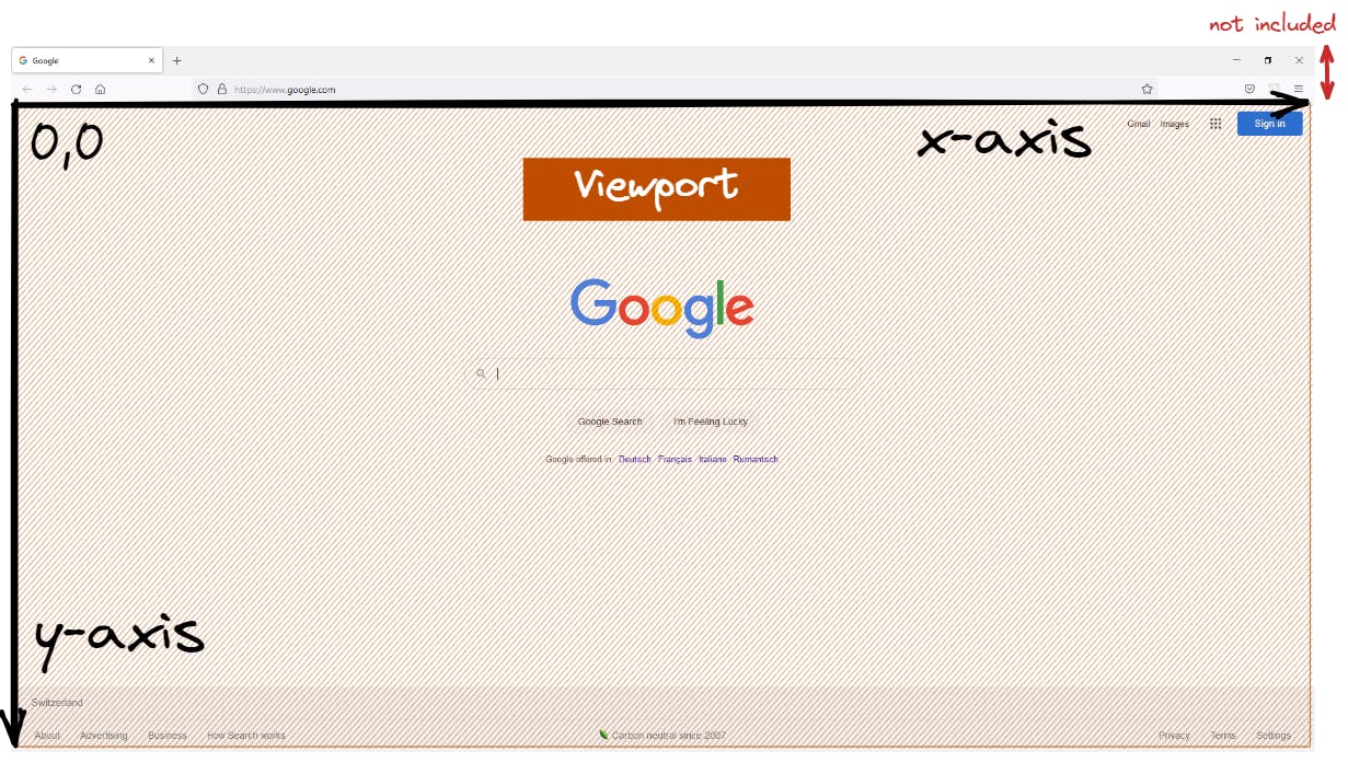
Any content that does not fit inside the viewport is not visible on-screen (like the footer of a long website). It comes into view only when you scroll your viewport down to that part of the content.
Items can be positioned on the browser viewport using CSS pixels as a coordinate system. The coordinates start at the top left of the viewport. To move to the right, increase the x value. Move down by increasing the y value.
div {
    position: absolute;
    top: 100px;
    left: 50px;
}
SVG Viewports
Viewports can be nested inside of each other. In fact, whenever you make a new <svg> element, it creates a new viewport and coordinate system inside the current viewport.
You can define the size and placement of the <svg> viewport using CSS, like any other HTML element. This is very handy because it allows you to use flexbox and flex grid to make SVGs responsive. Because they scale without losing quality, you can use the same graphic for all screen sizes!
Another way to adjust the viewport size is by using the width and height attributes of the <svg> element. This will change the size of the viewport but not the coordinate system. I avoid the width, and height attributes because styling <svg> with CSS classes gives me more flexibility (pun intended). Note that setting width and height using CSS will override the width and height attributes on the <svg>.
Check out the interactive demo below.
In the above example, I defined the length using percentages. You can set width and height values for top-level SVGs using length unit identifiers such as px, em, cm, mm, in, and percentages. The demo has two top-level SVGs: the "SVG Viewport" and the "Second SVG Viewport".
For the "Inner SVG Viewport" and all other nested elements, use user units and percentages.
User Units
A value without a unit is called a user unit. User units used on children of the browser window viewport will be interpreted as the same number of px units.
Once you have defined a viewport for an <svg> element, any child element of that SVG will use the <svg>'s user coordinate system. This is referred to as user space.
Any user units on SVG children will be converted to units of the <svg>'s coordinate system. Percentages will be interpreted as a percentage of the parent's viewport.
<!-- viewport will be 100px by 200px in the -->
<svg width="100" height="200">
    <!-- SVG content using SVG coordinates -->
</svg>
In short: When defining the outermost SVG, use length unit identifiers. When defining a child element, use user units and percentages.
The viewBox attribute
Remember how every <svg> element creates a new viewport and coordinate system? In the section above, we used the <svg> element's width and height to determine the viewport's size. Now we will use viewBox to specify the coordinate system.
Think of Google Maps: The viewport determines how big the map looks on your screen. The viewBox determines which part of the map you are looking at and how zoomed in you are.
<svg viewBox="<min-x> <min-y> <width> <height>">
It takes four numbers to define the viewBox.
The first two numbers (<min-x> and <min-y>) denote the upper left corner of the coordinate system. Which part of the map do we want to show on Google Maps?
The second pair of numbers (<width> and <height>) define the width and height of the viewBox in user units. How many kilometres across and down should the map show?
Every element we place inside the <svg> tag will use the coordinate system to determine its position and size.
If this sounds confusing, don't worry. Play around with the interactive demo below and get a feeling for what each value does.
In this demo, the viewport has a fixed height and width. The grid shows the size and position of the viewBox.
Notice how moving the "Min-x" and "Min-y" sliders of the viewBox will pan the image across the viewport. Even negative values are possible.
When we link the "Width & Height" slider, we get a zoom effect.
See how the rectangle uses the units of our viewBox coordinate system. If you manage to move the rectangle outside of the bounds of the viewBox, it will still be visible. The viewBox will not clip any content beyond its width or height because its only job is to establish a coordinate system.
If you make the width much larger than the height, you will notice that the grid does not entirely cover the viewport. This is because viewBox preserves its aspect ratio by default. We can control where in the viewport to display the grid using the preserveAspectRatio attribute.
The preserveAspectRatio attribute
The preserveAspectRatio attribute affects how the viewBox is scaled and positioned inside a viewport. The syntax looks like this:
preserveAspectRatio="<align> [<meetOrSlice>]"
You can define three things using this attribute:
- Whether to scale the viewBox uniformly or stretch the viewBox to fit the viewport (by setting
preserveAspectRatio="none") - Whether the whole viewBox should be visible inside the viewport (by defining the
<meetOrSlice>value) - How to align the viewBox within the viewport (by defining the
<align>value)
Let's go through them one by one. The following interactive demo lets you play with all values of the preserveAspectRatio attribute. Refer back to this demo after each of the following sections to visualize what each value does.
none
none is one of the ten values that <align> can take. The meetOrSlice value is ignored when setting preserveAspectRatio="none". If you set preserveAspectRatio="none", then the viewBox will not scale uniformly. That means that your viewBox will stretch and squish to match the dimensions of your viewport. Setting preserveAspectRatio to any other value will scale the viewBox uniformly, preserving its aspect ratio.
<meetOrSlice>
There are two choices here:
1. meet (default)
Force the whole viewBox to be visible inside the viewport, but have some empty space if the aspect ratios don't match.
If you are familiar with background images, meet is like background-size: contain. The entire viewBox will be visible inside the viewport. If the viewBox and viewport aspect ratio is not the same, the viewBox will not cover the whole viewport. The boundaries of the viewBox and viewport "meet" to fit the viewBox entirely inside the viewport.
2. slice
Make the viewBox cover the entire viewport, but slice off the parts that stick out.
slice is like background-size: cover. Here the viewBox will scale to cover the entire viewport. If the viewBox and viewport aspect ratio are not the same, parts of the viewBox will be outside the viewport and thus sliced off.
Again, the meetOrSlice value is ignored when setting preserveAspectRatio="none".
<align>
<align> can be one of 10 values. We discussed none earlier, so we only need to cover the remaining nine values. As we mentioned earlier, all nine values will preserve the aspect ratio of our viewBox and scale uniformly. These nine values concern themselves only with the alignment of the viewBox.
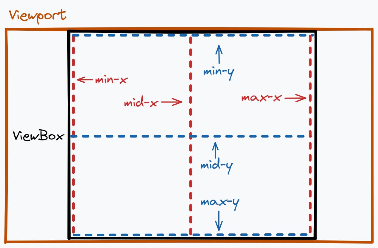
To align the viewBox with the viewport, <align> uses axes. We can use these nine values to define which axes from the viewBox and viewport should line up. For the viewport, there are six axes in total to choose from.
- 3 axes across (
min-x,mid-x,max-x) - 3 axes down (
min-y,mid-y,max-y).
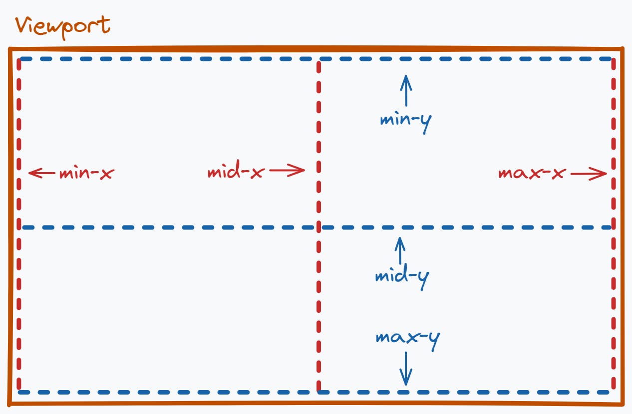
The "min" and "max" axes are at the outer edges of the viewport. The "mid" axes are at the midpoint between "min" and "max".
The same happens for the viewBox: 6 axes total, three across, three down.
So far, so good?
Using this, we can tell the SVG which axes from the viewport, and the viewBox should align. The images above show that the viewBox's "mid-x" axis aligns with the viewport's "mid-x" axis. The viewBox's "mid-y" axis aligns with the viewport's "mid-y" axis. This alignment centres the viewBox inside the viewport. We can define this behaviour using the value xMidYmid, which is also the default value for <align>.
You can align the viewBox using any of these axes. Instead of listing all nine values, I urge you to check out the interactive demo at the start of this section. See how the axes line up when using different <align> and <meetOrSlice> values.
Note that some values of <align> seem to have the same effect. Try changing the size of the viewport to see their differences. For a complete list of values, see the docs.
The xmlns Attribute
I want to draw your attention to one last thing. You might have seen something like xmlns="http://www.w3.org/2000/svg" on SVGs around the Web. The xmlns attribute defines the XML namespace to avoid name collisions. Don't worry about this too much. All you need to know is that you must add this attribute only to the outermost <svg> element. If you need further clarification, check out this explanation.
Conclusion
And that's it! You now know the three most important concepts for SVGs! All SVG shapes, paths and masks use these three concepts to determine their appearance. If you want to dig deeper, here is a complete list of SVG elements to explore!